Accessible Palette Case Study
This article follows one five-color sample palette from a visual reference through contrast review, rejected combinations, and final CSS token decisions.
Last Reviewed
2026-10-01
How This Was Tested
The palette was extracted from the sample visual below, reviewed with HexAnyTool, and checked again with contrast math before the final tokens were written.
Goal
Choose which colors can become text, surface, or highlight tokens without losing accessibility.
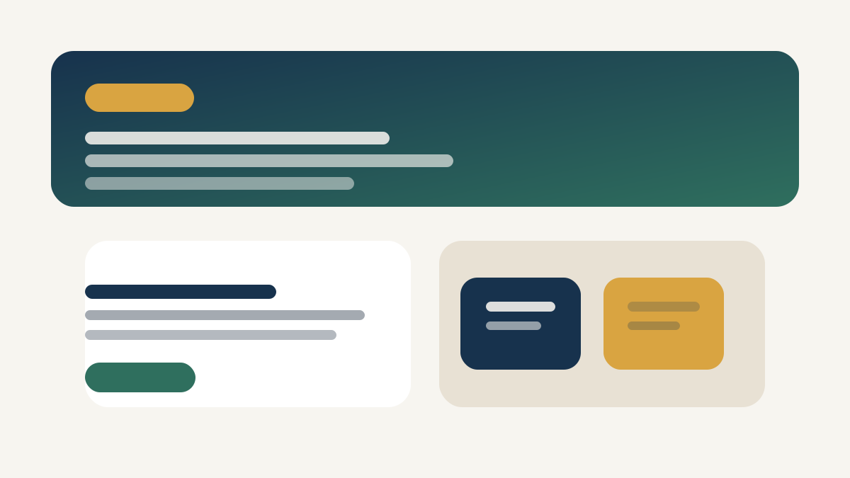
Sample visual used for extraction
Instead of using a brand image with copyright limits, this walkthrough uses a sample landing-page composition created for the article. It contains a dark hero, a green accent, a warm highlight, and two neutral surface colors.
Extracted palette
The first extraction returned `#17324D`, `#2F6F5E`, `#D9A441`, `#E8E1D4`, and `#F7F5F0`. Those values are useful because they span one dark text candidate, one strong accent, one decorative highlight, and two light surfaces.
| Extracted color | Initial role | Reason to keep reviewing |
|---|---|---|
| #17324D | Text candidate | Dark enough to test against both light surfaces. |
| #2F6F5E | Accent candidate | Strong but still muted enough to consider for UI controls. |
| #D9A441 | Highlight only | Likely decorative, but still worth checking for badges. |
| #E8E1D4 | Secondary surface | Warm neutral that can divide content zones. |
| #F7F5F0 | Page background | Quiet base for the other four colors. |
Contrast review before approval
The first decision was not which color looked nicest. It was which pairings could survive real text use. The table below shows the combinations that were checked before any token was approved.
| Pair | Ratio | Decision | Why |
|---|---|---|---|
| #17324D on #F7F5F0 | 12.05:1 | Accepted | Safe for body text and headings. |
| #2F6F5E on #F7F5F0 | 5.42:1 | Accepted with role limit | Strong enough for links, buttons, and short labels. |
| #D9A441 on #F7F5F0 | 2.06:1 | Rejected for text | Useful as a badge fill or decorative border only. |
| #F7F5F0 on #17324D | 12.05:1 | Accepted | Suitable for hero text on the dark surface. |
Rejected combinations still matter
The failed gold-on-cream pairing was not wasted work. It clarified that `#D9A441` should stay decorative instead of becoming a primary label token. That single rejection prevented a misleading highlight color from spreading into buttons and text styles.
This is the main reason to treat extraction as a review process rather than a copy-paste shortcut. The fastest palette is not always the safest one.
Final token set after review
:root {
  --color-page-background: #F7F5F0;
  --color-surface-secondary: #E8E1D4;
  --color-text-primary: #17324D;
  --color-accent-brand: #2F6F5E;
  --color-highlight-decorative: #D9A441;
}
The naming shows the outcome of the review. Only one color became decorative-only, one became the main accent, and the darkest tone became the stable text token.
What to copy into your own workflow
- 1. Keep the extracted palette and the final token set separate.
- 2. Record rejected text pairings, not only the accepted ones.
- 3. Promote a color to a reusable token only after its likely foreground and background pairings are tested.